• Dear forum reader,
    To actively participate in our forum discussions or to start your own threads, in addition to your game account, you need a forum account. You can
    REGISTER HERE!
    Please ensure a translation into English is provided if your post is not in English and to respect your fellow players when posting.
  • We are looking for you!
    Always wanted to join our Support or Forum Team? We are looking for enthusiastic moderators!
    Take a look at our recruitment page for more information and how you can apply:
    Apply
  • Forum Contests

    Won't you join us for out latest contest?
    You can check out the newest one here.

New Content Great Building Contribution Window

DeletedUser105873

Since only some will get this advantage before others I'd like a list of the players who have it first please, since inno and devs claim not to be bias I presume they have no problem letting everyone know who is favoured for this update first
 

DeletedUser4727

Thanks all.

As explained, the staggered activation is to gauge the effectiveness of the feature. Some of you may note that the feature is not going to be activated on other markets just yet, just the International server.

The players being selected will be done so automatically by the system. There will be no published list showing who does and who does not have the feature.

I understand people's frustrations here, but the intention isn't to show favouritism, but is entirely to get a firm analytical view of the impact the feature has, as well as to hopefully gain some additional feedback for improvements. I'm sorry if this causes upset, but this is how we've decided is the best way to gather the data we need.

Yes, the feature has been active in a similar way on Beta for a while, and has evolved due to Beta feedback. The purpose of activating it in such a way on EN is getting a bigger sample size.

Richard
 

Galechade

Corporal
but the intention isn't to show favouritism, but is entirely to get a firm analytical view of the impact the feature has, as well as to hopefully gain some additional feedback for improvements.

Inno already got feedback from Beta. If it wasn't the feedback they wanted to hear, too bad. That's what Beta is there for. By Inno's own definition, anything that provides an advantage to one player over another is a cheat. So now Inno is providing that cheat to their specific group of players. It’s no wonder Inno won't stop others from cheating when they are doing it as well. Sad indeed.
 

DeletedUser105873

So 5 months of analytical results on beta isnt long enough, but 2 weeks on en server is, really Soverign is that the best you can do, this is a joke and reinforces why I dont buy diamonds no more, the game is corrupt, the devs are corrupt and the in game mods are a joke, I've just had a ticket closed with no further action against a player that is so obviously cheating with 2 push accounts running even someone who doesn't play the game can see it. I dont know what this game is coming to but the longer it goes on the bigger the joke it gets, you got in game mods in place that cant be bothered and now we got pathetic excuses for giving some players advantages over others for limited periods of time, really not sure whether the time investment is worth it anymore.
 

DeletedUser99363

uhmm roll it out to the top 500 players on each server TY, we are the active ones to give best feedback, yes please add + button for the 2 and 5 FP packs, are even easier 1 click input number directly all done next :)
 

DeletedUser96901

uhmm roll it out to the top 500 players on each server TY,
they want compare the old with new window
would be bad to compare 90% of the donations with the remainig 10% :lol:

how about even ranking number get it
odd numbers not

we are the active ones to give best feedback
releasing it to only some players is not to get feedback (they did get many on the beta server which almost all where ignored)
it is to test how the new version works compared to the old one when many players use them at the same time (on beta there are too less players for them to get the needed values)
 
Last edited by a moderator:

DeletedUser16112

I believe the answer is: They haven't solved the "donating race condition" and they don't know how!

ie. Two people both want to secure second spot in a GB for 167FP - Both enter 167FP to secure; Both click the confirm button at the same time; one must win second spot is secured; next thing that will happen the loser in the race condition will fill in 3rd spot - the GB WILL Level and the loser WILL lose many FP's.

Now imagine 3 or 4 people attempting the same thing - Chaos - and extremely angry people.

I don't think that this is a plausible reason. For any persistent multiuser database you would need adequate concurrency measures - i.e. the first request to donate (by the microsecond) will be done and the second will generate an error. You probably have seen this in action when you have gotten an error message when you try to polivate a building that just got polivated by someone else. Same principle.
 

DeletedUser107059

The change that would be more use for many users - especially new players - would be to show all prizes in the donation window immediately regardless of if they have been taken. It wastes silly amounts of time to go log onto wiki to find out what the 3rd place prize pays
 

Vesiger

Monarch
All right, there's a major problem with this new window on the mobile app - it only shows the top two contributors.
I've got a massive picture of the Great Building taking up most of the screen, then only two and a half lines of the contribution list visible beneath that in a window that doesn't scroll ; exactly the same problem as with the new forum design, massively amplified by the fact that there appears to be literally no way to access the useful content that's being obscured by the pretty picture.
Especially ironic when you're looking at past levels and the legend reads "You have already finished this level. You can see all the contributors" - ah, no, you can't :mad:
And when you're trying to contribute to other people's GBs, you can't see how many FPs your immediate neighbours in the list have put in (unless you happen to be in the top slot already) and how many extra you would need in order to get a reward - basically, this change removes a large amount of the functionality of the window. Has it really been thought through?
If the list scrolled, it would be a massive pain to use but just about still functioning; as it is, it's pretty much unusable.
 

DeletedUser4727

All right, there's a major problem with this new window on the mobile app - it only shows the top two contributors.
I've got a massive picture of the Great Building taking up most of the screen, then only two and a half lines of the contribution list visible beneath that in a window that doesn't scroll ; exactly the same problem as with the new forum design, massively amplified by the fact that there appears to be literally no way to access the useful content that's being obscured by the pretty picture.
Especially ironic when you're looking at past levels and the legend reads "You have already finished this level. You can see all the contributors" - ah, no, you can't :mad:
And when you're trying to contribute to other people's GBs, you can't see how many FPs your immediate neighbours in the list have put in (unless you happen to be in the top slot already) and how many extra you would need in order to get a reward - basically, this change removes a large amount of the functionality of the window. Has it really been thought through?
If the list scrolled, it would be a massive pain to use but just about still functioning; as it is, it's pretty much unusable.
I've just tested on my own device, and I'm able to scroll the list. Are you sure the function doesnt work? If so, what device? Might be one for bugs, cos could be due to screensize.
Inno already got feedback from Beta. If it wasn't the feedback they wanted to hear, too bad. That's what Beta is there for. By Inno's own definition, anything that provides an advantage to one player over another is a cheat. So now Inno is providing that cheat to their specific group of players. It’s no wonder Inno won't stop others from cheating when they are doing it as well. Sad indeed.
It isnt really about if the feedback is what they wanted to hear, and much more about getting a broader spectrum of analysis. The amount of players on EN is significantly larger than on Beta. We simply want a bigger sample size.

uhmm roll it out to the top 500 players on each server TY, we are the active ones to give best feedback, yes please add + button for the 2 and 5 FP packs, are even easier 1 click input number directly all done next :)
This doesn't give a real world understanding of what impact the change is having. All this does is tell us how it affects spending habits of the top 500 players.
 

Addonexus

Chief Warrant Officer
what happens in this situation:
player 1 has the old version and is slower, starts dropping 2000FPs total
player 2 has new version, he notice that player 1 is slower and starts dropping FPs fast, and wins
#1 reward causing player 1 to lose hundreds of FPs.
the loss is caused because one of them was given a chance to contribute faster, so i guess, the tickets start coming in soon?
 

DeletedUser109603

Can I be one of those lucky players that don't get this new dialog? The design is poor and does nothing to improve clarity about what is going on; the automatic use of fp packs is particularly unwelcome. Inno clearly have something against fp packs, having removed them all rewards except quests and GB contributions.
 

Vesiger

Monarch
All right, there's a major problem with this new window on the mobile app - it only shows the top two contributors.
I've got a massive picture of the Great Building taking up most of the screen, then only two and a half lines of the contribution list visible beneath that in a window that doesn't scroll
Actually, I tell a lie; the picture is on the overview screen. The issue with the contributors list is the big 'spend 1 FP/10 FP/from bar/ finish with diamonds' header, which is more of a problem since that's a major part of the new functionality.

Can't we have a left/right split, with the FP spending options on the left of the window where the old GB picture used to be, and the complete (and scrolling!) list of contributors in a right-hand column?

I've just tested on my own device, and I'm able to scroll the list. Are you sure the function doesnt work? If so, what device? .
You're right; it doesn't display a scrollbar, but it does scroll. That moves the interface up from 'unusable' to just 'very annoying' (a bit like trying to edit forum replies in a window that shows a sliver of two lines of text plus an on-screen keyboard :-p)

Early feedback from other members of my guild: "it's driving me nuts" :-(
 
Last edited by a moderator:

KnightOnion

Private
I'm one of the lucky ones getting the new screen. Overall I think it is a good improvement. However I have four suggestions / concerns.

Firstly I don't like the order in which it spends the FP packages. If I click 10, I would expect it to spend a 10 FP package and not use the 2's and 5's first. I am annoyed that I am left with only 10 FP packages and no 5's and only two 2's. When it comes to spending 5 in the future, it will have to use a 10 FP package and put 5 into my bar, meaning I have to log on within 5 hours so as to stop losing the once an hour FP.

Secondly I would also suggest adding a 5 button so that I can tell it to spend a 5 FP package in one click. A 2 button is may be not necessary but would be useful.

Thirdly I agree that it is unfair that I have the new screen and my competitors don't. In a race for first spot on a very high level GB, I would beat someone who started paying in before me but is having to pay in with more clicks.

Fourthly it would be useful to have a "Buy 1 FP with Coins" button.
 
Last edited:

DeletedUser110434

I think our server is lucky to have been chosen as a live test bed for this, and I think it's regretful, if not a bit short sighted, that so much energy will be wasted on arguing the point of whether this two-week time period of staggered release represents some sort of unforgivable advantage to the players who either got it or didn't. Personally I do not find it an advantage at all, as it takes me a lot more time now to donate precise amounts while maximizing resources.

I hope that after this initial fervor is over, we can all focus on giving feedback that might end up making this sub-optimal feature something that can actually be a real improvement.

My biggest concern, as has been mentioned here, is the loss of control over the cashing in of my packs. I also do not like it that I can no longer leave FP in my bar and donate solely with packs. I use all of my own production on my own Arc, and when I go to donate to investments, I would like to leave my bar alone. With this, that is no longer possible.

For example, let's say I have six FP in my bar, and I want to lock first place on a GB that requires 19 to lock. Under the old method, I could use a 10, 5 and two 2 packs and have 19 in it, while the six are still in my bar. With this update, I have to give up the six in my bar, then hit 10, which gets me to 16, then hit 1 three more times to get to 19. Since that would have meant cashing in two 2 packs, the extra one goes back into my bar. But now I only have 1 in my bar when I wanted to keep six, so I have to go cash more packs if I want to get the five more back in my bar. This is inconvenient to say the least. It is a prime example of when UI is designed by developers, and not by users (I am a developer myself, and I often fall victim to just this sort of thing, as I think as a dev and not as a user.)

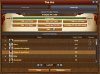
I have worked up what I think would be an improvement on this thing, and I have attached the image here in hopes it might be considered.

Additionally, the window size on mobile with this thing makes it really hard to evaluate the top five on a GB. That is a very poor design and needs to be adjusted to allow at least the top five to be available with no scrolling required.
 

Attachments

  • DonateWIndow.jpg
    DonateWIndow.jpg
    107.6 KB · Views: 201
Last edited by a moderator:

DeletedUser108047

The general consensus from my guild - go back to the old format and add a 10 fp button. The new version is not an improvement
 

DeletedUser110615

I just looked at the new GB window in the announcement - Well I must say looks like the "Improvement" is not quite that.

I should be able to see the top 5 people Without having to scroll - just like the old way - My sense is that the more you try to make the entire user interface based on the mobile version, the worst this entire game is going to get.

Having a 24 inch monitor look like a GIANT mobile app is just plain ridiculous!
Microsoft tried it with windows 8 and found it didn't work - so they quickly changed it back.

You do see the top 6 without having to scroll on browser version. All this changes in that regard is, that you can see everybody while before you could only see top 6 (At least that's how I remember it. Never paid that much attention to it).

Overall, I think this is a step in the right direction. I like that I can easily view what rewards next level will bring me (before I always went to the wiki for it and still do not know if the info is available in-game). Other than that, I think a "Donate 5 FPs" button is a must. 2 FP one sounds redundant, since I never got a 2 FP pack so far nor I know where they could be obtained. The last thing I think would be a good improvement is to preffer usage of higher packs. So, for instance if you want to donate 16 FPs, the game would use 1×10FP, 1×5 FP and 1×2FP pack (if the player has one - otherwise use 2×10 FP packs, since that's equal to 1×10 FP and 2×5 FP).

EDIT: Sounds like it already works as one would expect. Neat! :)
 
Last edited by a moderator:

DeletedUser110419

I like the new design. The tabs allow for information separation. The scrolling list of contributors is fast and easy. FPs get spent as expected (had 5 in my bar, clicked the Use 10 FP button three times to spend 23 FP for level-up, spent 1 10-FP, 1 5-FP, and 2 2-FP, leaving 1 FP in my bar). The Jump to Current Level button is a nice/useful feature. It's nice to see the Available FP. In the Overview, it's nice to be able to see current and next level bonuses without having to scroll over.

Since there is plenty of room (currently taken up by a large image of the GB), why not display the Blueprints information there directly instead of using another window? I would prefer that the window always default to the Level Up tab, and not to the tab last opened.
 

DeletedUser110705

I like the new design too and combined with the feature that you can fill your fp bar nicely with packages out of the inventory before starting donation, i dont see that much need for change - it would be nice but not necessary imo
 

DeletedUser105873

I think our server is lucky to have been chosen as a live test bed for this, and I think it's regretful, if not a bit short sighted, that so much energy will be wasted on arguing the point of whether this two-week time period of staggered release represents some sort of unforgivable advantage to the players who either got it or didn't. Personally I do not find it an advantage at all, as it takes me a lot more time now to donate precise amounts while maximizing resources.

Yeah really,,,you wanna try adding 2400 FP's and then come back and tell me you dont find it quicker and an advantage to click 240 times instead of 480 ?

The issue with the old (for most current) system isnt with placing small amounts of FP's its placing thousands thats the issue, as already mentioned by someone above all it needed was the addition of a "use a 10fp pack" button to reduce the amount of clicks by half which is all this updated version has to offer anyway.
 
Last edited by a moderator:
Top