Forwandert
Lieutenant-General
The collect all which someone bored decided to move again. Appears to not only have been randomly placed offset to everything but yet again moves depending on what you press.


Yep. Once again more unnecessary clicks in the gameStacked buff bar is awful, impossible to see which ones are active and how much of each buff is remaining as you play. have to click in and out to check. Please remove this "improvement" or provide settings option to toggle between this and showing all as before.
The announcement would have been nice if it had arrived before the changes bewildering everyone, and not after.Announcement: nice (guessing people don't read official tab messages, maybe you could just write changes in bullets not as one sentence)
That would be really badIf the event quests also end up hidden

What is a buff?????
A buff is something which makes an element in a video or role playing game more powerful.What is a buff?????
Yes, no daily log in bonus on desktop - so far?CLICK BAIT
say it so in your in game news title it's mobile only
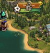
Come on guys! This is getting ridiculous, our screens are becoming crowded with icons. Why isn’t the event icon in line vertically with the other two icons. And why do the icons have to be so big!!! Reduce them by at least 50%.
View attachment 25090
Come on guys! This is getting ridiculous, our screens are becoming crowded with icons. Why isn’t the event icon in line vertically with the other two icons. And why do the icons have to be so big!!! Reduce them by at least 50%.