-
Dear forum reader,
To actively participate in our forum discussions or to start your own threads, in addition to your game account, you need a forum account. You can REGISTER HERE!
Please ensure a translation into English is provided if your post is not in English and to respect your fellow players when posting.
-
We are looking for you! Always wanted to join our Support or Forum Team? We are looking for enthusiastic moderators!
Take a look at our recruitment page for more information and how you can apply:

You are using an out of date browser. It may not display this or other websites correctly.
You should upgrade or use an alternative browser.
You should upgrade or use an alternative browser.
Why do icons have to be so large
- Thread starter Malynn
- Start date
An Hobad
Private
I came here to say exactly the same thing. It was bad enough before they stuck that unnecessary green square of useless info where the event icon used to go, but to then stick huge icons covering up the gbg/pvp area is absolute madness. Why not just cut out all access to the game for mobile users - it's not like it's accessible now anyway.
Also, get rid of the stupid X covering the diamonds amount when the quest screen is open. Clicking anywhere on the screen closes that area - the X is just more unnecessary clutter. Who designs these things anyway? Put a bit of thought into it for a change.
Also, get rid of the stupid X covering the diamonds amount when the quest screen is open. Clicking anywhere on the screen closes that area - the X is just more unnecessary clutter. Who designs these things anyway? Put a bit of thought into it for a change.
Forwandert
Lieutenant-General
The main issue I have is you have to zoom to certain sizes to get to the things around it and it's easy to start trying to tap gbg or colony and end up on the event or vice versa. It can get quite annoying. The bottom right would be better as there's nothing really down there getting hidden. Or drag the others down slightly and move it over that would probably make enough difference.
Its just very central on a small screen which highlights the size even more and looks out of place.
Its just very central on a small screen which highlights the size even more and looks out of place.
An Hobad
Private
I came here to say exactly the same thing. It was bad enough before they stuck that unnecessary green square of useless info where the event icon used to go, but to then stick huge icons covering up the gbg/pvp area is absolute madness. Why not just cut out all access to the game for mobile users - it's not like it's accessible now anyway.
Also, get rid of the stupid X covering the diamonds amount when the quest screen is open. Clicking anywhere on the screen closes that area - the X is just more unnecessary clutter. Who designs these things anyway? Put a bit of thought into it for a change.
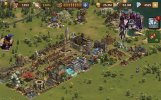
If I want to see my city, everything else is covered - settlement, ge, gbg, and gbg. Ridiculous.
Attachments
Malynn
Corporal
Exactly. So much time is spent zooming in and out and dragging the screen around to avoid covering buildings, incidents etc with these huge icons. As soon as you zoom in you end up covering more buildings with icons. It’s like playing hide and seek half the time.The main issue I have is you have to zoom to certain sizes to get to the things around it and it's easy to start trying to tap gbg or colony and end up on the event or vice versa. It can get quite annoying. The bottom right would be better as there's nothing really down there getting hidden. Or drag the others down slightly and move it over that would probably make enough difference.
Its just very central on a small screen which highlights the size even more and looks out of pla
suethegreat
Captain
Big icons seem possible but when trying to read requirements for story and daily quests the font is tiny and you have to zoom to read them even with reading glasses lol. At one time there was so much on the right of the screen that incidents could barely be seen and naturally the go to place to put them! Scroll up or down and a tiny sliver peeps out if lucky. (laptop here not mobile)
DJ of BA
Warrant Officer
INNO did some time ago bring in smaller icons which were great for Browser and Android players but only those playing on a tablet or computer with a reasonably large screen, phone users couldn't see them clearly and so it was scrapped and reverted to the present size, it certainly would have been better to have this as a variable option in settings where the player can choose the size he or she is happiest with, and as for that useless green icon, yes, wish they would scrap it,
quicksilver99
Private
Frankly even on PC the Halloween event icon was annoyingly and intrusively large.
Paladiac the Pure
Major-General
Really? Looks to be the same size and using up basically the same amount of screen space as the icon for every event.Frankly even on PC the Halloween event icon was annoyingly and intrusively large.
Share: