-
Dear forum reader,
To actively participate in our forum discussions or to start your own threads, in addition to your game account, you need a forum account. You can REGISTER HERE!
Please ensure a translation into English is provided if your post is not in English and to respect your fellow players when posting.
-
We are looking for you! Always wanted to join our Support or Forum Team? We are looking for enthusiastic moderators!
Take a look at our recruitment page for more information and how you can apply:

You are using an out of date browser. It may not display this or other websites correctly.
You should upgrade or use an alternative browser.
You should upgrade or use an alternative browser.
DeletedUser111510
Looks good. I'm looking forward to trying it out.
DeletedUser108831
Better, but still lacking. For quest selection, why not simply have a menu like you have in production. Players can select the recurring quest they want next rather than cycling through those they don't want. Sure, I can have the "don't show again" but what if I do want to see it again but not as often. A menu to pick a quest wouldn't have required all this work either seeing you already have it for supplies and goods.
Same problem as with the GB contributions... if you can type a number to trade goods, why can't you type a number to add fps?! You seem so proud as I read the text above but I see little ingenuity given to this effort.
PS- kudos for making fp contributions faster on iOS...still slower than typing a number, but much better now than before.
DeletedUser96901
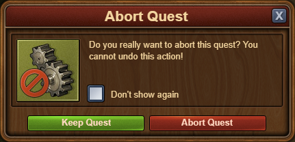
and how an about a "don't show this quest again"-checkbox for recurring quests (the actual quest not the abort confirmation) ?- A "don't show again"-checkbox was introduced for the recurring quest aborting confirmation.
Blitz Epidemic
Warrant Officer
One of your best updates to date, after the aid button! Anything to save time.
Next how about giving us the option to not have to see someones tavern when visiting. Also for GVG give us an alarm that goes off whenever we're being sieged.
DeletedUser110407
The new Quest Overview is awesome! Its so much easier to check what I need to do on Story, Side and Bonus Quests now that they are all in one window.
There is one negative thing and I know this was bought up on the Beta Forum. The white speech box is difficult to read for those of us with vision problems, like myself. It would be better in off-white or cream, so its not harsh on the eyes.
There is one negative thing and I know this was bought up on the Beta Forum. The white speech box is difficult to read for those of us with vision problems, like myself. It would be better in off-white or cream, so its not harsh on the eyes.
DeletedUser110195
Yes, there are some recurring quests that people just don't care to finish and skip every time. Would be nice if they could just be auto-skipped.and how an about a "don't show this quest again"-checkbox for recurring quests (the actual quest not the abort confirmation) ?
DeletedUser11207
Thank you for giving us a tick box so we don't have to keep confirming the Abort quest.
Personally, I preferred the quest layout how it was before. The new quest screen, and the buttons to open it from the city view, look tacky.
It would be great to have the option to tick a box to "Don't show me this quest again".
Personally, I preferred the quest layout how it was before. The new quest screen, and the buttons to open it from the city view, look tacky.
It would be great to have the option to tick a box to "Don't show me this quest again".
DeletedUser108688
Facepalm !!!
The new overview works well in the browser and being able to abort recurring quests faster is most welcome.
However the quests are now a major step backwards on the app. We have lost the visual cue that shows us what the quest is about. Instead we are given the boring text (that nobody reads).
The below pics show the same recurring quest on the browser and app for comparison.
Browser version

App version

We have no idea what this quest involves so we have to accept the quest by tapping "OK" in order to see which one it is.

Ah, ok it's the "gather supplies" quest. I want to skip this one but where is the abort button????? So to make things worse we have to tap the little book in a text window to get back to the previous window to abort the quest.
With the old system 2 taps would abort the quest.
With the new system, even with the "Do not show this again" option enabled it takes 3 taps to abort the quest.
The devs have just gone and made this very tedious.
I assume this was implemented like this because of insufficient space in the window. This is easily solved by giving us the visual cue with the abort button on the first window like on the browser, and putting the text into the second window that can be accessed by tapping the book icon.
Like this..

Please fix this
The new overview works well in the browser and being able to abort recurring quests faster is most welcome.
However the quests are now a major step backwards on the app. We have lost the visual cue that shows us what the quest is about. Instead we are given the boring text (that nobody reads).
The below pics show the same recurring quest on the browser and app for comparison.
Browser version
App version
We have no idea what this quest involves so we have to accept the quest by tapping "OK" in order to see which one it is.
Ah, ok it's the "gather supplies" quest. I want to skip this one but where is the abort button????? So to make things worse we have to tap the little book in a text window to get back to the previous window to abort the quest.
With the old system 2 taps would abort the quest.
With the new system, even with the "Do not show this again" option enabled it takes 3 taps to abort the quest.
The devs have just gone and made this very tedious.
I assume this was implemented like this because of insufficient space in the window. This is easily solved by giving us the visual cue with the abort button on the first window like on the browser, and putting the text into the second window that can be accessed by tapping the book icon.
Like this..
Please fix this
Last edited by a moderator:
DeletedUser5180
Aborting quests on iOS are slower now
Crap update
Crap update
Prinza the Hunter
Monarch
I totally agree. I and others made the same comments on the beta forum when the app was given a very short time in beta, too (but not the current version - that never was beta tested).However the quests are now a major step backwards on the app. We have lost the visual cue that shows us what the quest is about.
...
With the old system 2 taps would abort the quest.
With the new system, even with the "Do not show this again" option enabled it takes 3 taps to abort the quest.
The devs have just gone and made this very tedious.
The browser initially went into beta slightly worse than the app is now, and it was in response to comments that the new ability to not have to confirm aborts was introduced. The browser was fixed.
One of the devs even wrote on the beta forum and stated that the app was going to be changed to work the same way as the browser (but with swipe enabled to abort, so you don't actually need an abort button, though there is no way to guess that unless you do it accidentally).
I barely touch my city on beta now and have written about why.
Yet this half-baked mess-up is what app players are supposed to tolerate?!? I will do so only for a short time. I expect and want a game to be hard but not to have the interface get in the way of my enjoyment.
NO!!I assume this was implemented like this because of insufficient space in the window. This is easily solved by giving us the visual cue with the abort button on the first window like on the browser, and putting the text into the second window that can be accessed by tapping the book icon.
That still would mean being faced with the story, not knowing what the task is and having the extra click. My suggestion at beta was that the story be the first thing to show on the first time around only and then the task be shown with abort button. The browser window was not enlarged when they merged story and task together in response to complaints; the developers should have copied that solution in entirety.
Last edited:
Prinza the Hunter
Monarch
OK, now that I remembered I can swipe left to abort, along with getting rid of the abort confirmation, it is not too slow. It is merely annoying because I have to tap "OK" on the story window when I am fairly sure it is not OK and I don't want that recurring quest and there is no reason why I shouldn't see the task in the first place.
Prinza the Hunter
Monarch
Strange how similar the simple interface ideas are to what has been suggested on the beta forum!Better, but still lacking. For quest selection, why not simply have a menu like you have in production. Players can select the recurring quest they want next rather than cycling through those they don't want. Sure, I can have the "don't show again" but what if I do want to see it again but not as often. A menu to pick a quest wouldn't have required all this work either seeing you already have it for supplies and goods.
Same problem as with the GB contributions... if you can type a number to trade goods, why can't you type a number to add fps?! You seem so proud as I read the text above but I see little ingenuity given to this effort.
PS- kudos for making fp contributions faster on iOS...still slower than typing a number, but much better now than before.
DeletedUser11207
OMG ... the comment I wrote earlier was from looking at it on my PC, but the screenshot about how it now looks on the app isn't making me look forward to logging in on my tablet later.
Please fix this urgently!
And do please have a rethink about how the whole quest overview looks now.
There is not a SINGLE member of our guild who's posted so far in our guild message who likes it as it stands - though it's a relief to finally not have to keep confirming quest aborts.
As others have said, the white background behind the text is glaring. The buttons to access the quest overview are ugly, the old ones were much nicer.
DeletedUser111532
Love the (browser side) update - I assume Treasure Hunt didn't get a similar treatment due to it being on its way out as a feature?
Praeceptor
Lieutenant Colonel
Got to agree with everyone else on this
Browser upgrade good (do we really need the horrible sliding animation though?). Could be better if recurring quests started on the one just completed, but we're all blue in the face waiting for this OBVIOUS change. Still, I guess we only asked Inno about this 4 years ago - they probably haven't read the message yet.
App upgrade terrible; really, really terrible. Why don't Inno listen to their beta testers?
DeletedUser109966
For recurring quests it's not nearly as enjoyable... why do the quests jump to the top when completed, why are the quest boxes not a universal size and why is the collect button not next to the abort??... it's OK for one or two quests... but when you are doing a lot, all this moving around with the cursor is highly un-enjoyable.... doesn't feel like a design made by people who are playing the game outside of test conditions...
Prinza the Hunter
Monarch
In fairness, no beta tester before yesterday had any reason to think that browser-like functionality was not going to be implemented, so made no comments that wasn't being made by browser players. Yesterday, the app we see now was launched live without having ever gone through beta test or the opportunity for feedback. The app that went into beta test was worse than the current one, so some changes have been made.App upgrade terrible; really, really terrible. Why don't Inno listen to their beta testers?
I know there are some users who use both platforms. For their sake if nothing else, I would have thought the functionality of the platforms would be as identical as the difference between I/O methods allow. Swiping left is a good idea on the app, since it is what app users are used to (it is also implemented on Message Center (sic) but nowhere else that I know of). However, there is no reason not to put an abort button as well, which is much clearer for browser users occasionally using the app. Nor is there any reason not to link story and task together as they did on the browser following user suggestion.
Share: